

Can design for a trendy, sparkling soda company.
Can design for a trendy, sparkling soda company.
Zante
Zante
Zante
/


© Angela Lee 2025. All rights reserved.
Design and branding for beverages.
Design and branding for beverages.
November 2024
November 2024
Photoshop, Illustrator
THEME
TIMELINE
TOOLS
PROJECT OVERVIEW
Zanté is a (fictional) beverage brand that offers refreshing, fruit-based sodas tailored to a younger audience. The goal of this project was to design a beverage can label that stands out on shelves while maintaining a cohesive brand identity. Zanté's design emphasizes vibrant fruit illustrations and a distinctive colour palette for each flavour, ensuring it resonates with consumers looking for a refreshing, trendy drink.
PROJECT REQUIREMENTS
• Create a product name that aligns with the brand and works in both English and French.
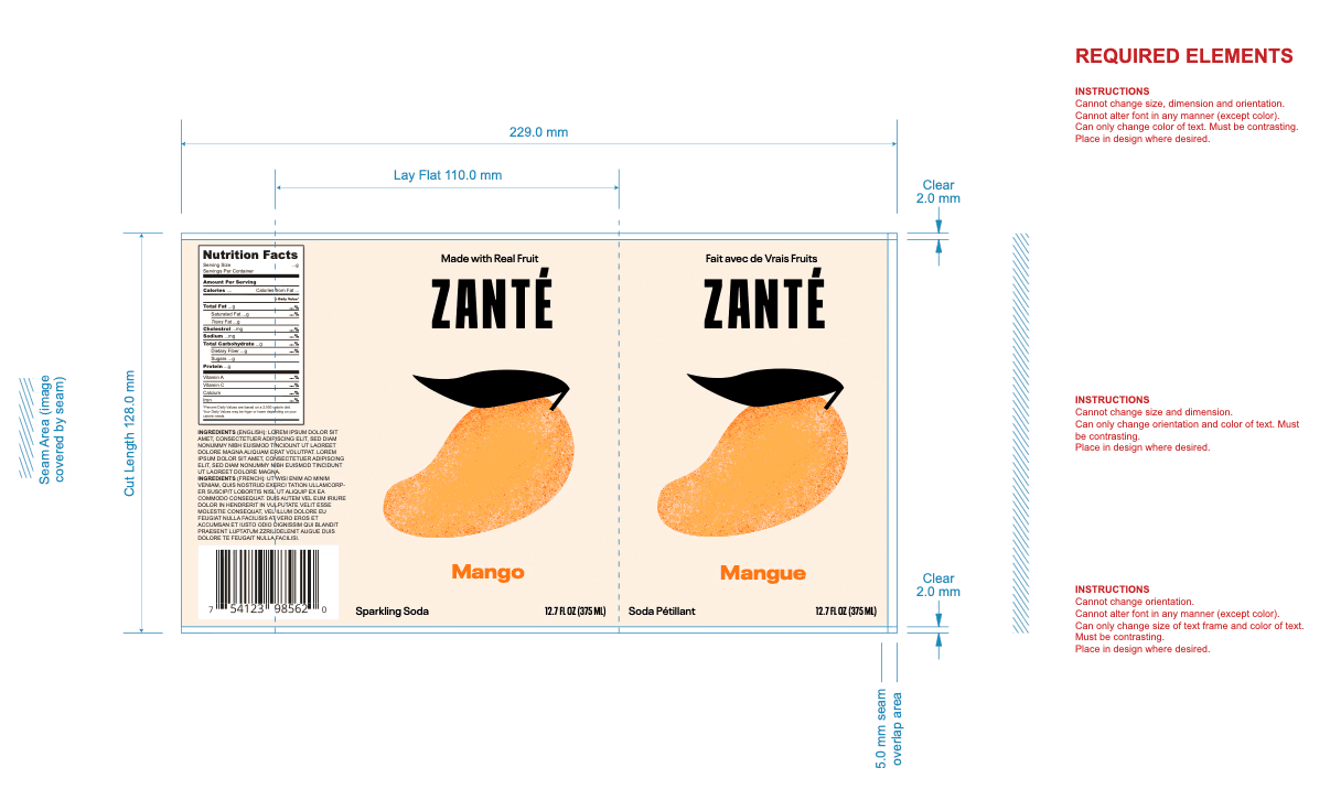
• Design a label with the necessary product details: barcode, nutritional information, ingredients, millilitre amount in both languages, and usage instructions—all within the specified dieline.
• Create two additional flavours or variations, ensuring that the designs are distinguishable while maintaining a consistent brand identity.
• Ensure that the final designs would translate easily to other flavours, keeping the core brand identity intact across different variations.
PROJECT REQUIREMENTS
• Create a product name that aligns with the brand and works in both English and French.
• Design a label with the necessary product details: barcode, nutritional information, ingredients, millilitre amount in both languages, and usage instructions—all within the specified dieline.
• Create two additional flavours or variations, ensuring that the designs are distinguishable while maintaining a consistent brand identity.
• Ensure that the final designs would translate easily to other flavours, keeping the core brand identity intact across different variations.
DESIGN CONCEPT & INSPIRATION
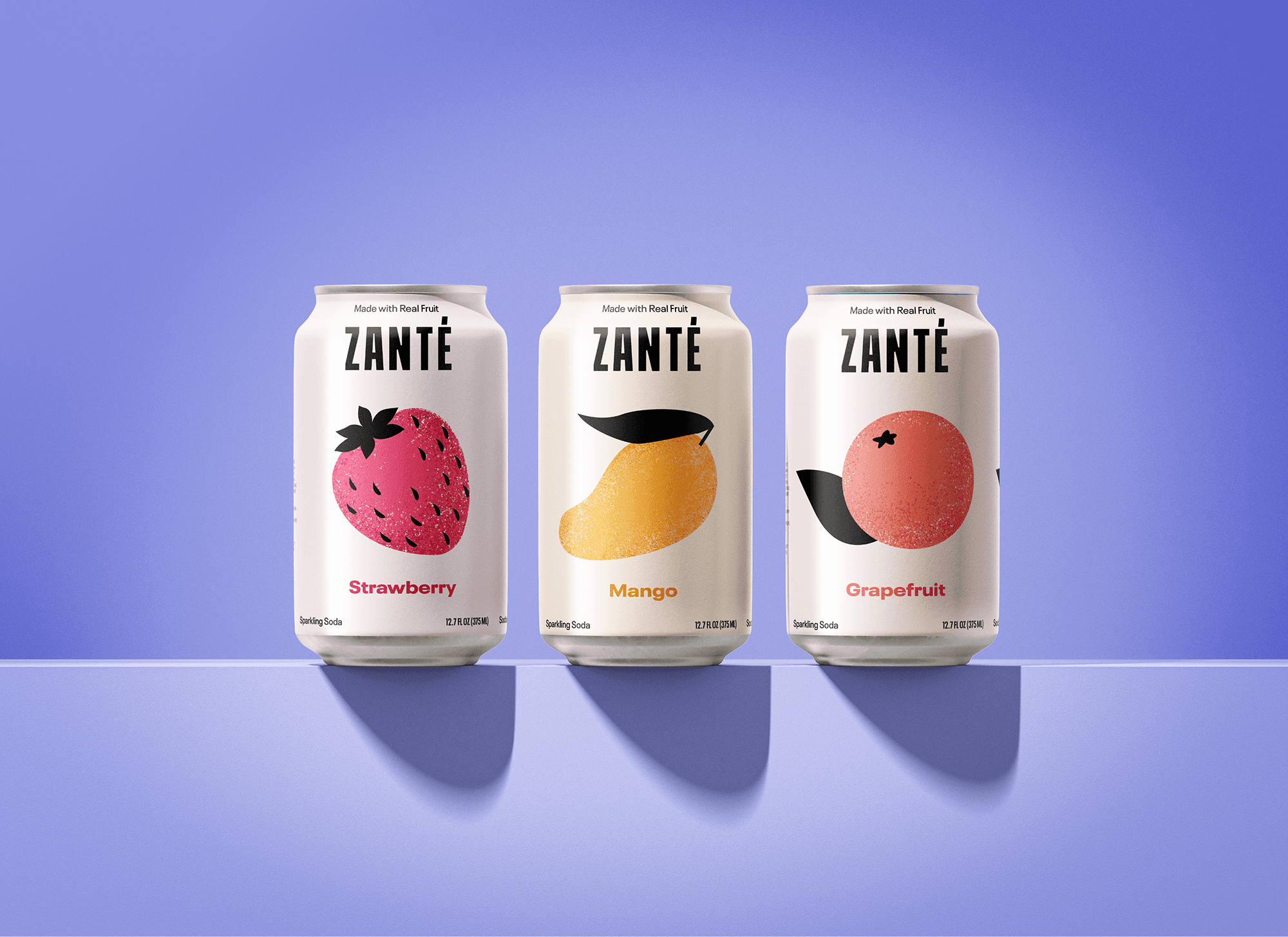
For the beverage can design, I opted for a sparkling soda aligning with the cool and refreshing nature of the brand called Zanté. The grain texture on the can’s graphics was chosen to represent the "fizziness" of the soda, visually tying the product to its sparkling and effervescent qualities. Each flavour has its own fruit illustration and a distinct colour to help differentiate them while maintaining a cohesive design language.
DESIGN CONCEPT & INSPIRATION
For the beverage can design, I opted for a sparkling soda aligning with the cool and refreshing nature of the brand called Zanté. The grain texture on the can’s graphics was chosen to represent the "fizziness" of the soda, visually tying the product to its sparkling and effervescent qualities. Each flavour has its own fruit illustration and a distinct colour to help differentiate them while maintaining a cohesive design language.
KEY TAKEAWAYS
While meeting specific project requirements, I gained valuable experience in learning the intricacies of packaging design such as label content and adhering to dieline specifications.
I enjoyed the process of ideating with a brand name, having the vision and art direction come together, and visualizing the elements through mockups, all while maintaining brand integrity.
Brand Naming
The name "Zanté" was derived from "frizzante" (Italian for "fizzy") to create a playful and memorable name that works in both English and French pronunciations. This bilingual approach ensures that the brand appeals to a broader market.
Brand Naming
The name "Zanté" was derived from "frizzante" (Italian for "fizzy") to create a playful and memorable name that works in both English and French pronunciations. This bilingual approach ensures that the brand appeals to a broader market.
Brand Naming
The name "Zanté" was derived from "frizzante" (Italian for "fizzy") to create a playful and memorable name that works in both English and French pronunciations. This bilingual approach ensures that the brand appeals to a broader market.
Font: BalboaPlus Fill
Font: BalboaPlus Fill
Font: BalboaPlus Fill
Label Elements
All essential information, including barcode, ingredients, and nutritional details, was designed within the dieline as required. Special attention was given to the placement and legibility of these elements to ensure compliance with labeling standards while maintaining the design’s visual appeal.
Flavour Variations
To meet the assignment's requirement for two additional flavours, I maintained the same graphic style and colour scheme (for Strawberry and Grapefruit), using distinct fruit illustrations. The vibrant fruit imagery and black accents were consistently applied across all variations, preserving the brand's overall identity.
Design Thinking and Brand Identity
The goal was to create a design that felt trendy yet simple, appealing to a younger, design-conscious audience. By using complementary colours and bold fruit illustrations, I achieved a playful, modern aesthetic. The grain texture on the graphics was used to reinforce the sparkling, refreshing quality of the soda, and I thought it would look beautiful on print. The texture not only enhances the visual appeal, but also ties into the brand’s essence of effervescence.

Design and branding for beverages.
November 2024
Photoshop, Illustrator
THEME
TIMELINE
TOOLS
